How the central finances of parties have been panning out
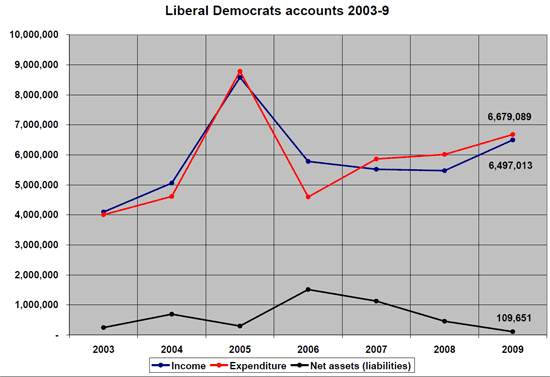
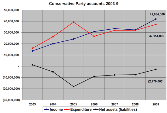
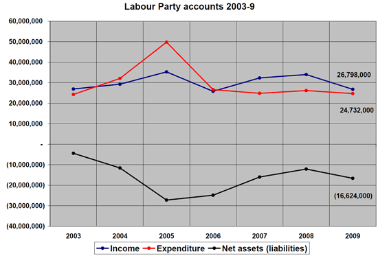
The following three graphs are from the Electoral Commission, showing income and expenditure for the three main political parties as reflected in their annual accounts. There are some important exceptions to what they show, such as the money brought in and spent directly by election candidates, though from what I know of these exceptions they paint a similar picture to those annual accounts of the relative trends over time.
As Stephen Tall has often noted when reporting on the quarterly donation figures, the Liberal Democrat figures show a consistently higher level of income in this Parliament than in previous ones. The net assets figures also show how the Liberal Democrats have been consistently in the black, unlike either of the other two main parties.
Note: the graphs have different scales
@Kelpsych @noeticat @robstick Brain fail, was remembering wrong, @markpack's figures here http://bit.ly/9WGf9f