What do the academics say? The science of bar charts
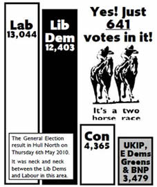
Many parents are concerned about how easy it is for children to access Lib Dem bar charts online. pic.twitter.com/Gpgf3j2xFW
— Cambridge Caption (@CamCaption) April 4, 2015
Welcome to the latest in my series highlighting interesting findings from academic research. Today – bar charts. Or, more precisely: why bar charts? Not why push tactical voting and ‘we can win here’ messages (on which see here), but why bar charts rather than pie charts, line graphs, scatter graphs or any of the myriad of other graphical devices available?
Pie charts make an occasional appearance in political leaflets but bar charts are so much the dominant form that the idea of switching to pie charts was the concept behind one of Liberal Democrat Voice’s April 1st spoof postings a few years back. However, the reasoning behind this is talked about only very rarely, despite their being some hard-nosed scientific research behind it.A good example is William S. Cleveland and Robert McGill’s academic paper Graphical Perception: Theory, Experimentation, and Application to the Development of Graphical Methods (September 1984, Journal of the American Statistical Association) (hat-tip: FlowingData).
 What they found was that when it comes to the sorts of comparisons required for a tactical voting / we can win here message, scatter plots and bar charts generally are better understood than pie charts and graphical devices that rely on volume (rather than length) or intensity and shades of colours.
Where bar charts edge it over scatter plots in leaflet design is, in my view, that scatter plots need clear axises and space to be easy to follow. Bar charts work better in the more crowded environment of leaflets as they retain more of their clarity as other elements intrude around them than scatter plots do.
The 2011 World Infographics Summit also saw a discussion over the relative merits of bar charts, pie charts and other graphical devices with, as Scientific American reported, the case for pie charts being harder to understand again being made. Most importantly, “the human brain is more adept at comparing lengths than areas”.
That’s all not to say that the choice of bar chart over other devices was based on careful psychological and graphical design research. But the advantages of bar charts do help explain why they seemed to be the right choice and why they prospered.
As for the first bar chart, that is rather hard to pin down although I’ve narrowed it down to between 1974 and 1979.
Leave a Reply