What to do when you’re struck by just how different two pieces of data are? Why, draw a graph of course. Hence this, triggered by the very differing picture of Liberal Democrat fortunes told by the latest YouGov and ICM polls:

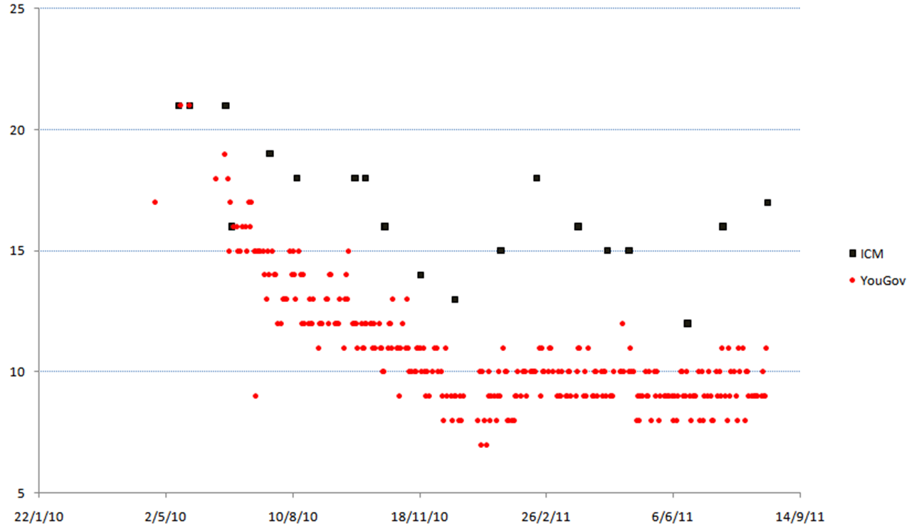
Liberal Democrat ratings in all the published YouGov and ICM polls since the 2010 general election, dated by first day of their fieldwork
Keep up with the latest news and analysis
about the Liberal Democrats with my
free monthly email newsletter.
I scour hundreds of blogs and dozens of media outlets for the best news and analysis - so you don't have to. It's completely free and you can leave the list at any time. So why not give it a try today?
You might also be interested in...


RT @markpack New from me: How ICM and YouGov compare http://t.co/QTvxCZZ
RT @markpack New from me: How ICM and YouGov compare http://t.co/A2ySXaL
New from me: How ICM and YouGov compare http://t.co/WEvl4hp
Brilliant chart from @markpack on ICM vs YouGov http://t.co/R3POLGB
How ICM and YouGov compare: http://t.co/17C9qef
RT @tlittleford How ICM and YouGov compare: http://t.co/t22aVTv
RT @tlittleford How ICM and YouGov compare: http://t.co/G0nB406
How ICM and YouGov compare: http://t.co/qQaqylv < Interesting graph showing differences in the trend of LD support between the 2 pollsters.