Bar charts: three things to remember about their power
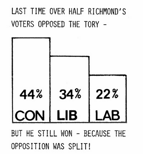
1. Visualising data makes it more persuasive
2. Bar charts are better than pie charts or other graphical devices
For presenting election results at least, according to the academic research.
3. When done properly, bar charts convey a vital political message
Time and again research has shown that the message behind a bar chart is one that gets voters to switch their views.
P.S. Use of Lego is optional. But cool.
P.P.S. When did the first tactical voting bar chart appear on a political leaflet?
Leave a Reply