Swings swing back again, or why you should not get excited by the next opinion poll
Don’t get excited by big movements in the opinion polls: it’s the trends that matter.
Sunday 29 March 2015 was heaven for political geeks with a love of logical puzzles. It was also a salutary warning for anyone who set great store on digital listening statistics that give percentage changes on the previous day or week.
Two opinion polls came out, the first carried out since the election ‘debate’ the previous Thursday when Cameron and Miliband appeared in back-to-back interviews and Q&A sessions on TV. One showed that Labour were four points ahead of the Tories, who in turn were four points ahead of Labour in the other.
This example of Escher Polling was a salutary illustration of the risks of paying too much attention to a single opinion poll, whose apparent movements are often caused by sampling error rather than actual shifts in opinion and whose headlines are rapidly contradicted by the next poll.
This example of how an exciting statistic is noise, rather than a meaningful insight, is an important lesson for data from outside politics too. The classic digital listening report or marketing dashboard is replete with percentage changes on the previous day or the previous week. They often trigger much discussion yet without clear presentation of the longer-term trends that clarify what is noise and what is meaning.
From poll to poll
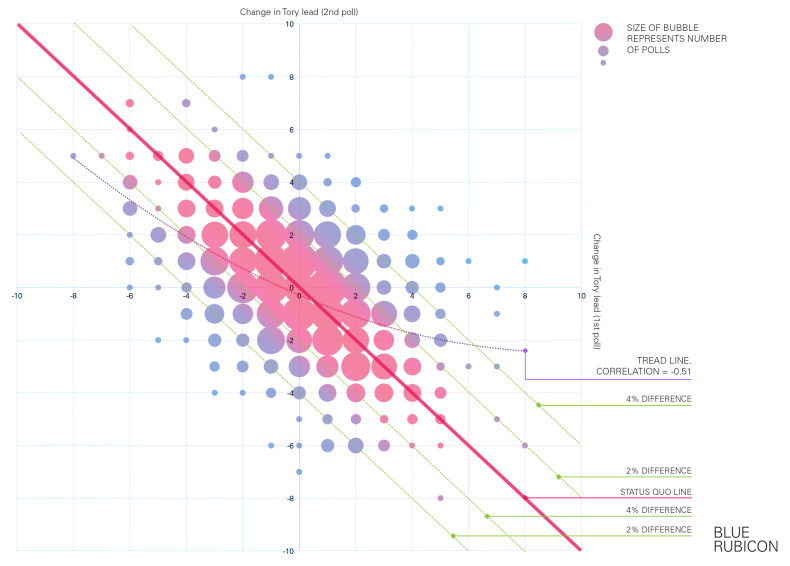
To illustrate this, we’ve carried out some exclusive analysis of the national voting intention polls published through this Parliament – and it shows that the sensible reaction to seeing the lead shift one way between Labour and the Tories is to expect the next poll to show it shifting back.
We’ve taken a look at the full 1,179 national voting intention polls published by YouGov since the 2010 general election. (1,179 at the time of writing; it will doubtless be higher by the time you read this.)
Look at the detail
Our graph shows the change in the Conservative lead over Labour in each poll compared to both the previous and the next poll. For example, if one YouGov poll showed the Tories 3 points ahead, the next 6 points ahead and the one after 2 points ahead, the numbers we’re interested in is +3 (the change in the Tory lead between the first two) and then -4 (the change in the Tory lead between the last two).
The question is, do these example numbers – showing a swing one way being followed by a swing back – reflect what really happens?
In short – yes. Or in numbers – the correlation between the changes in one poll and the next is large and negative, at -0.51.
If a poll shows a big swing to one party’s lead, then the experience of this Parliament is to expect, on average, a swing back of half that straight away in the next poll.
Hence the picture in the graph, with the trend line going from top left to bottom right, reflecting how the reaction to a poll showing a movement one way is for the next to show a movement back.
The reasons for dampening your excitement when the poll movements are big are even greater.
On 176 occasions YouGov scored a 4 points or greater move in the lead between Labour and the Conservatives. Yet on only 45 occasions – just 1 time in 4 – was the difference still at least 4 points or greater once the next YouGov poll appeared. Indeed, it’s twice as likely – 91 occasions – for the second poll to return things to within a point of the first poll.
As the trend line shows, the bigger the swing one way, the bigger the expected swing back the next.
Moreover, there’s very little evidence of movement generating momentum – hence the paucity of bubbles in the top right or bottom left corners of the graph. If one YouGov poll showed a move in the lead one way, the next was more than two-and-a-half times as likely to show movement back the other way rather than further movement in the same direction.
Or in other words – beware the noise and look at the trend, as the apparent initial movement is rarely sustained.
Long-term trends
Likewise, outside of politics real insight comes from understanding the long-term trends, especially when other factors such as the changing seasons add another layer of potential confusion.
For example, one of Blue Rubicon’s clients’ website traffic comes more heavily from mobiles during the summer than in the winter. If you only focus on the immediate changes in data this leads to a series of excitable updates in the spring about how mobile access is growing, followed a few months later by an intriguingly counter-intuitive apparent trend of mobile access shrinking during the autumn. It’s only when you step back, look over the whole year and compare it with previous years that the real picture emerges.
Understand the trend, not just the latest data point – that’s good advice both for election watchers and for brands.
Leave a Reply