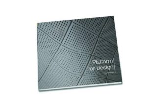
Platform for Design: a picture of Crossrail in which everyone has to be slim
 Platform for Design, Hugh Pearman’s book about the design work that is going into the stations and trains for Crossrail to ensure the stations are efficient, pleasant and long-lasting, is at times a frustrating mix of the fascinating detail and boilerplate design brochure speak.
There is much to enjoy and be impressed by as the book shows the care being taken over design details, revealing also the subtle (and otherwise most likely missed) links between many of them and the local history of the station where they are located.
People who have lived through the farce of the roll out of indicator boards on the London Underground which were often obscured from view by other signs will also be glad to find the care being taken to ensure clear views of signs and to minimise clutter on platforms.
Wrapped around this information is the sort of conventional design jargon and formalities found in many a brochure pitching a development plan. Transformed urban spaces restoring civic pride with enhanced urban focus are promised and regularly illustrated. All, of course, without the bins, traffic lights and other realities of life which are – as with guttering and drainage pipes on CGI renderings of property developments – the profession’s standard omission from such imagery. (Although, curiously, one house in this book is blessed with being allowed to show a drainage pipe down its side.)
One particular oddity about the design brochure conventionalities is the waistline of the people who populate the book. It is stuffed with high quality colour images of what new stations and platforms will look like. These are populated by a carefully balanced range of people – all ages, genders, races and levels of physical mobility or eyesight are there. Yet they are also slim. It’s a multicultural world of people using Crossrail, as long as you are below average weight – an omission is all the more striking given the care that has gone into making the figures balanced in all sorts of other ways. As with bins and traffic lights, normal waistlines do not exist in this world.
If you like this, you might also be interested in Helvetica: the film about a font.
Got a view on this review? Then please rate it on Amazon.
Buy Platform for Design by Hugh Pearman here.
Leave a Reply