What do you make of this graph about gender and politics? (2010 version)
This is an update of the post I did earlier in the year, this time including the data for 2010.
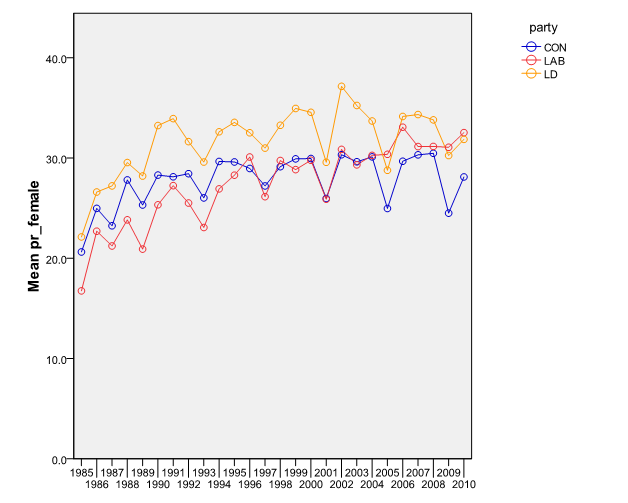
Here’s the proportion of local election candidates of the three main parties who were female over the last twenty-five years. As you can see, proportions for all three parties grew in the late ’80s and since then have stalled (Lib Dems, Conservatives) or only crept up (Labour), with all of them remaining well under 40%.
The dips every four years are due to county council elections having a much lower proportion of female candidates than other local elections.
So, what do you make of this? Does it matter? Should the flat trend for the Liberal Democrats over the last twenty years be a cause for concern, especially as it has plateaued at a level well below the c.47% figure for the proportion of party membership which is female? And why has no party seen its proportion get close to the proportion in the UK electorate?
Thanks to Michael Thrasher of the University of Plymouth for supplying the data and graph. They are primarily based on an analysis of the names of all of the candidates standing each year.
Leave a Reply