The problem with poll cards, 2011 vintage
Millions of pounds have been spent in total in the UK on testing various forms of electronic voting, in the hope that this might raise turnout in elections. The overall verdict across different technologies – such as voting by SMS or online – has been remarkably consistent: it’s expensive, not very reliable, of dubious security and, above all, has almost no impact on turnout levels.
It’s easy to see how the idea of using modern technology has caught the eye and budget of decision makers. But with the emphasis on the high-tech, boringly old-fashioned items such as paperwork have got much less attention. And so, I present to you the humble poll card.
This document, sent to everyone who is entitled to vote in an election, is a crucial piece of communication. In most elections it is the only ‘official’ communication an elector receives. In many cases, given the varying ability of parties to campaign in different parts of the country, it may be nearly the only – or indeed the only – piece of paper electors receive about the election at all. It tells people how and where to vote. With millions of poll cards sent out each year, it’s a major potential way of communicating with the public about elections.
And poll cards look awful.
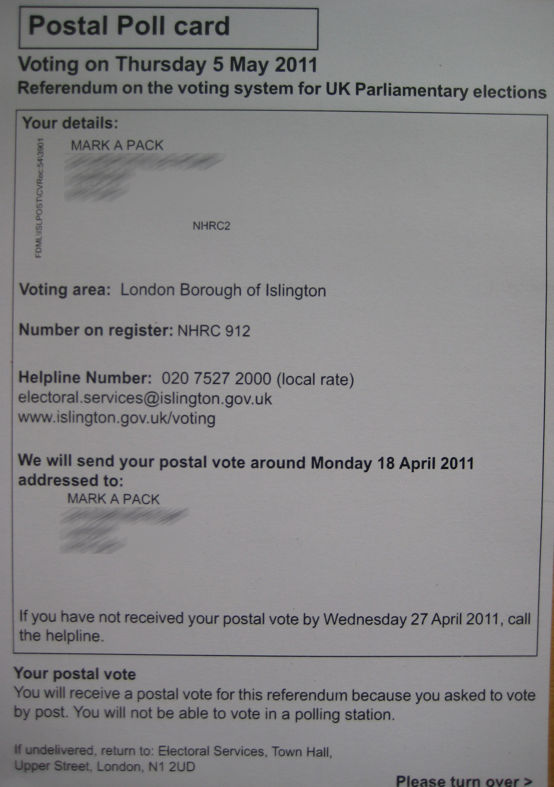
Poll cards look dull, uninviting and give you no reason to get interested in, or excited by, the prospect of voting. Take this example, which is my own poll card from Islington Council:
In fairness to Islington, two things should be said. First, the design of poll cards is heavily constrained by what legislation lays down. Second, Islington has been at the forefront of trying to do good things with poll cards, such as putting maps on them ahead of this becoming widespread practice. (My own, pictured above, doesn’t have a map because I am a postal voter.)
Front of poll card: key information buried at bottom
But even so, the front of the card has a myriad of different fonts / faces / sizes. That in itself should be a big warning sign that the design is not as good as it could be.
In addition, my electoral register number is given great prominence – but for a postal voter poll card (which won’t be taken to a polling station and shown to staff or tellers) this is information that has very little use. Yet the important information on the front about when I should start worrying about non-receipt of ballot papers is buried at the bottom, given far less prominence. Overall, compared to the 2009 version – which suffered many similar problems – the 2011 version has a front that is no better, and arguably is in fact worse.
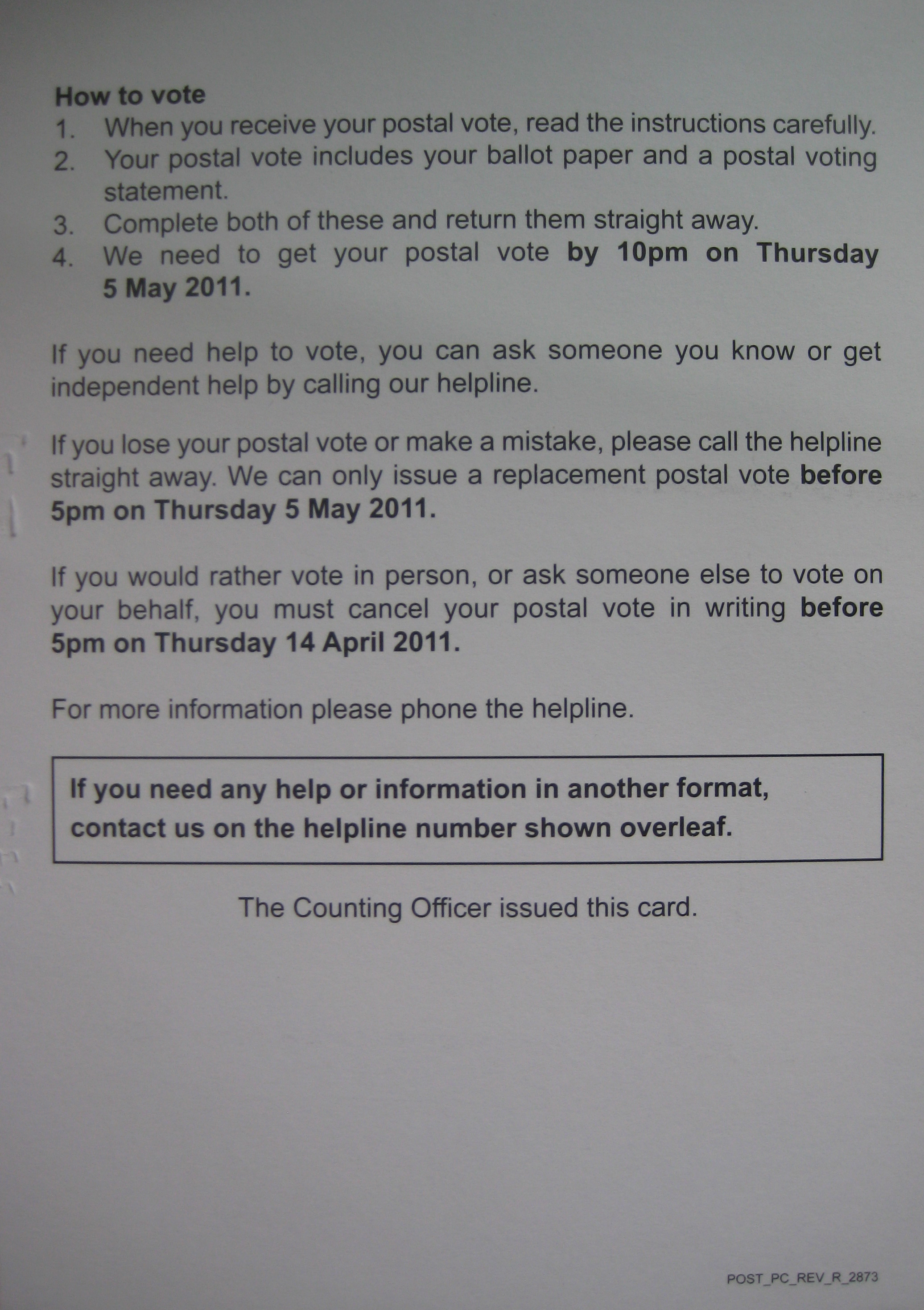
Reverse of poll card: key information missing
The reverse is a little better. The text tries to cover the key issues in plain English. However, it would not take a great designer to do better, such as with some sub-headings. Moreover, the detailed wording is not done well. Point 2 adds very little to point 1, but point 4 – one of the key pieces of information – is left ambiguous. Does that mean I can post it in a postbox by 10pm? Or that it has to arrive in the post by then (in which case when do I have to post it)? Or does it mean I can return it in person by some non-postal means? Answers there are to all these questions, but the poll card doesn’t provide them.
The reverse is a slight improvement on the 2009 version, but it is still pretty poor going.
Better designs are long overdue
And overall? Well, it looks like a boring official document. It hardly leaps out for my attention and does not make even the most cautious of attempts to interest me in elections. I love reading forms in all their details, though I decided not to tell US Immigration about the typo in the footnote on one of theirs; you never quite know how an armed guard is going to respond to being challenged over punctuation. But for better or worse the world’s not made up of people like me.
Compare this poll card with the way in which your gas or electricity or water bill is laid out. Those are also documents that people don’t really rush to the doorstep with enthusiasm to read, but the companies issuing them know it is in their interest to try to present the information as attractively as possible – and they manage it, without undermining the basic objective presentation of information. It’s about time the humble poll card got the same treatment.
This is an update of my 2009 piece about poll cards. The 2011 vintage shows how the time for better poll cards has not yet arrived.
Poll-cards couldn’t agree more.
On e-voting, I wonder if it isn’t just that the British are rubbish at innovation. In Estonia E voting was brought in for general elections in 2007, turnout went up 5% with 3% of people voting online. In 2011 it went up a further 2% with 15% voting online. And all this against the backdrop of a fairly dull trio of elections in which 4 centrist parties swapped 1 or 2 seats back and forth and then reformed the same coalitions.
That said, Estonian e-voting is made possible by the terrifying power of the Estonian identity card, so whilst it might work that doesn’t necessarily make it a good thing.