Economic statistic of the week: who has the bulk of savings?
Today’s statistic is courtesy of the Office of National Statistics and their video podcasts (a rather unpublicised source of information given its clarity, relevance and yet low viewership figures).
This graph looks at pension savings for the age group 54 – 64 held by households and sorts households into deciles based on how much savings they have (not, as is often the case with similar graphs, by income or expenditure). As you can see the 10% of households with the most household saving actually have almost half of all household savings:
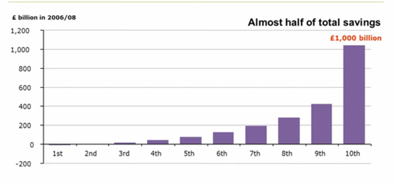
That’s quite a remarkable concentration of the bulk of savings in very few hands, and it is a concentration very rarely, if at all, mentioned when the impact on savers of changes in interest rates or tax rules are talked about.
Conversely, it also helps explain why the £4 billion per full year being raised by the government in cutting tax breaks for pension savings have attracted so little attention as it comes from a very small number of people for such a large sum. (Though, ironically, in this case the lack of attention is probably a drawback, at least as far as Liberal Democrats are concerned, because it’s one example of taxing the rich more which it almost never mentioned when the government’s track record is discussed).
Leave a Reply