Political infographic: how the Lib Dems are structured
In May I posted a political infographic, 1980s style, showing how the Liberal Party was structured.
Here’s an equivalent one for the Liberal Democrats, taken from the Morrissey report:
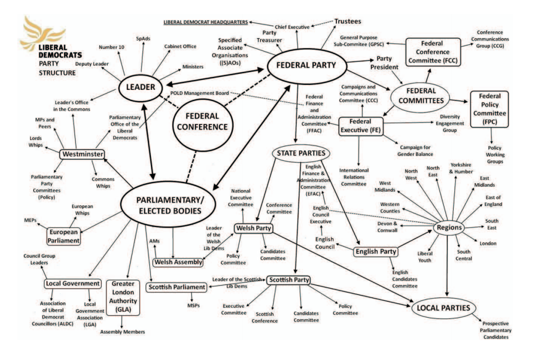
It is so easy to mock it’s worth pausing for a moment’s thought. It’s not a well-done diagram. Some – not all, but definitely some – of the complexity it contains is down to its design rather than the truth it is trying to represent.
UPDATE: And no wonder that more recent diagrams look very, very different.
Leave a Reply