How to make your graphs better: an excellent animated gif
Courtesy of Dark Horse Analytics comes this expert advice on how to improve your graphs, cleverly compiled into one animated gif:
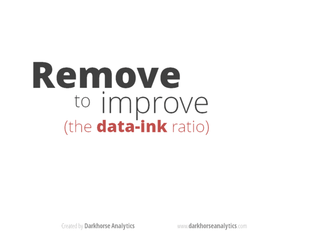
Less is indeed more.
For more on getting the visual display of information right, see Edward Tufte’s deserved classic book from the early 1980s. Too much data journalism, data analytics, big data and the like alas is done as if such good advice as his doesn’t exist.
Much of that is good advice, but lightening the typeface and making everything grey will exclude a lot of people from being able to read your chart.
I’ve never really understood this “make everything grey” rule of graphic design. It’s like they drum it into them in graphic design school.
I admit the first graph is overdone but the final version is distinctly underdone. And what is the significance of leaving bacon as the only coloured bar, unless the graph is about bacon, which is doesn’t seem to be. A version somewhere in the middle would seem to be best, but if I had to choose between the first and the last I’d definitely prefer to look at the original (unimproved) version.
I must be getting old.