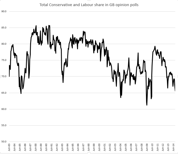
How the two-party share of the vote has fared in opinion polls since 1983
One advantage of curating the largest database of UK national voting intention opinion poll results* is the ability to look at long-term patterns. In this case, or so I thought before looking at the data, how the share of the vote claimed by the main two parties has slumped in the face of the proliferation of other parties.
Surprisingly, that’s not quite the picture as this graph** of polls since 1983*** shows. Yes, the current share being garnered by the two main parties is low, but it’s not off a cliff compared to other occasions in the last thirty odd years:
Of course, if the current trend continues…
But as the old doggerel goes:
A trend is a trend is a trend
But the question is, will it bend?
Will it alter its course
Due to some unforeseen cause
And come to a premature end?
* Probably. A group of academics also sometimes claim credit to this, but as we’ve exchanged data a few times and I’ve recently added some polls from before I was born, I’m claiming the title again.
** The monthly averages are a simple average of all the polls published in that month, so in months in which one particular pollster was more prolific, the results are weighted towards that pollster. For months where there was a general election, there are two data points – one each for the polls before and after the general election.
*** 1983 as prior to that the data starts to have some significant gaps. However all the data I do have going back to 1945 is in the spreadsheet, so you can look at even longer-term trends if you wish.
Leave a Reply