Lessons from Australia: poster design
A quick counterpart to my previous Lessons from Canada: poster design, this time looking at Australian election posters such as this one:
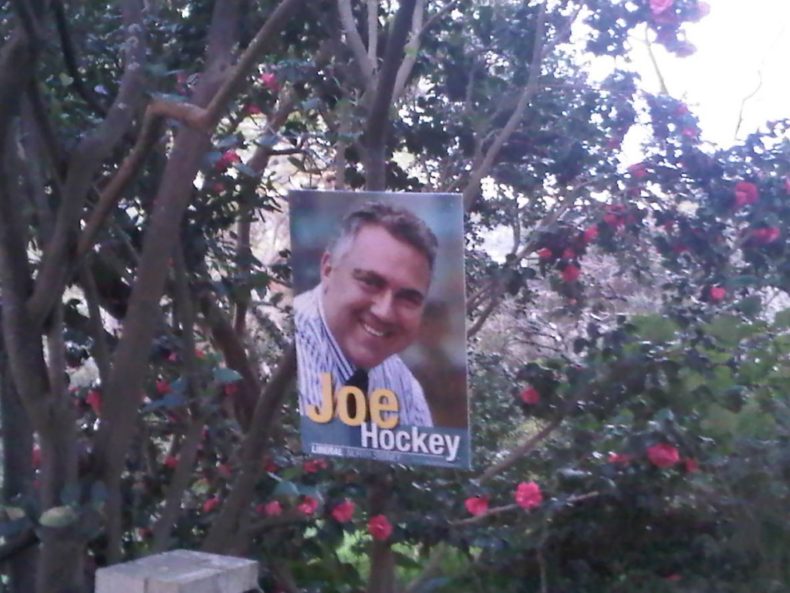
As you can see from this example from North Sydney, the usual Australian style (as is the case in European countries such as Germany) is to feature a candidate or party leader photo very large, with the name of the candidate or party more like a caption to the poster than its main content.
By contrast, in the UK, the name of party or candidate are usually the dominant information and in those rare cases with photographs those are usually no more prominent than the text and often an awful lot less prominent.
One advantage of photo based posters is that it encourages parties to ensure there is at least one good photograph of the candidate. If you’ve seen some of the staring bug eyed at the camera looking like a still from Crimewatch photos that grace some election addresses, you’ll know exactly why this can be a good idea…
Anyway, what do you think of the merits of this sort of design?
Leave a Reply