Ooops! Mirror gets poll graph wrong and inflates Labour’s position
I blogged earlier today about how the Daily Mirror bigged up a poll showing Tory support unchanged (within the margin of error) into a story of how their support was plunging.
But looking again at the story, I realise just how badly wrong their graph is.
The two key pieces of information about Labour’s rating in the poll are that:
(a) It was 30%
(b) It was 32% in the previous poll
Now look at the graph:
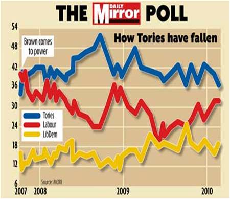
See what’s happened? What should be a downward Labour line has become a flat line and the end which should be at 30% is actually put at about 31%. Both the trend and the end point are wrong – and both in ways that flatter Labour.
Not good at all.
(You may notice that the Tory point also looks like it may be a little on the low side too, but having deployed ruler and calculator the overall impact on the graph is to make the Tory-Labour gap 25% smaller than it should be. Plus the Labour line is flat rather than down.)
Goodness me, iffy graphs/bar charts showing a distortion of polling preferences.
It’ll never catch on 🙂
Rob