The embarrassingly awful official information for the London Assembly elections
Yesterday I covered the appearance of Caroline Pidgeon’s London Mayor election address. It is from the booklet being distributed to all five million plus London voters, which also contains information about the London Assembly election.
Except, alas, this is the triumph of dullness that passes for presenting information on who the London Assembly list candidates are:
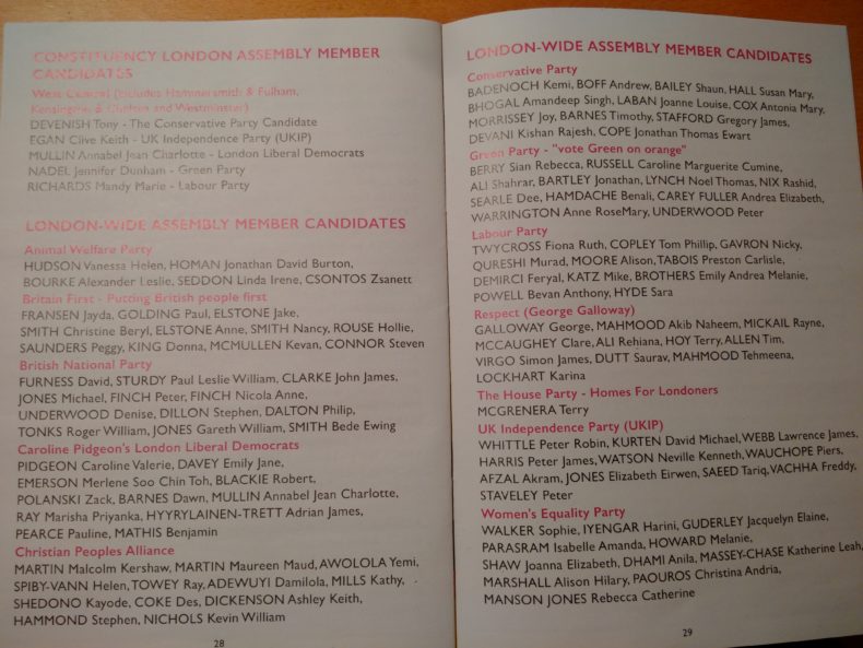
Could you deliberately have set out to make this page duller and less interesting? Well yes, if you had tried really hard. And at least it doesn’t use Comic Sans.
But really, as an example in how to present public information to voters, it’s awful. Yet this is also what money is being spent on sending out to over five million voters. This isn’t just a quick one-off production for someone’s neighbourhood watch newsletter. It’s a mass mailing whose quality does not in any way live up to its volume.
One reasons for its awfulness, alas, is that it isn’t alone. Many polling cards are nearly as dreadful. Because designing high quality paper electoral administration communications just doesn’t get much of anyone’s attention. Which is why so much public money continues to get spent on such important documents whose design is so poor.
Leave a Reply