Why you need to inspect data visually
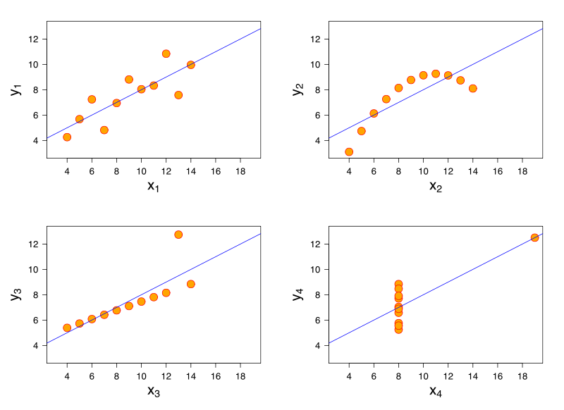
I hope Francis Anscombe‘s friends and family will forgive me not noticing his excellent example data until half a century after he published it, but Anscombe’s Quartet is excellent.
Four sets of data which share very similar summary statistics (e.g. mean and variance) but which, when you look at them, are clearly very different in many important ways.
A great reminder of why you need to inspect data visually and not just rely on automated number crunching:
Intrigued that Wikipedia has an entire category for “misuse of statistics.”
Twice I’ve seen this in a week, but never before!
And if you aren’t very competent with figures, people will try and bamboozle you!